
What's the
project
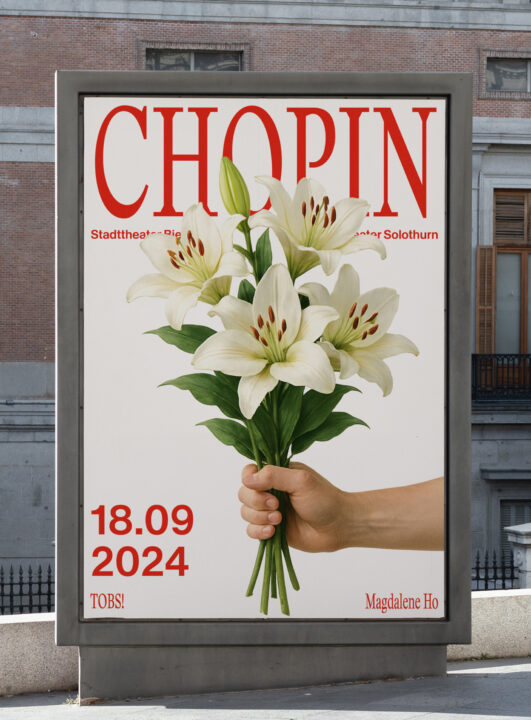
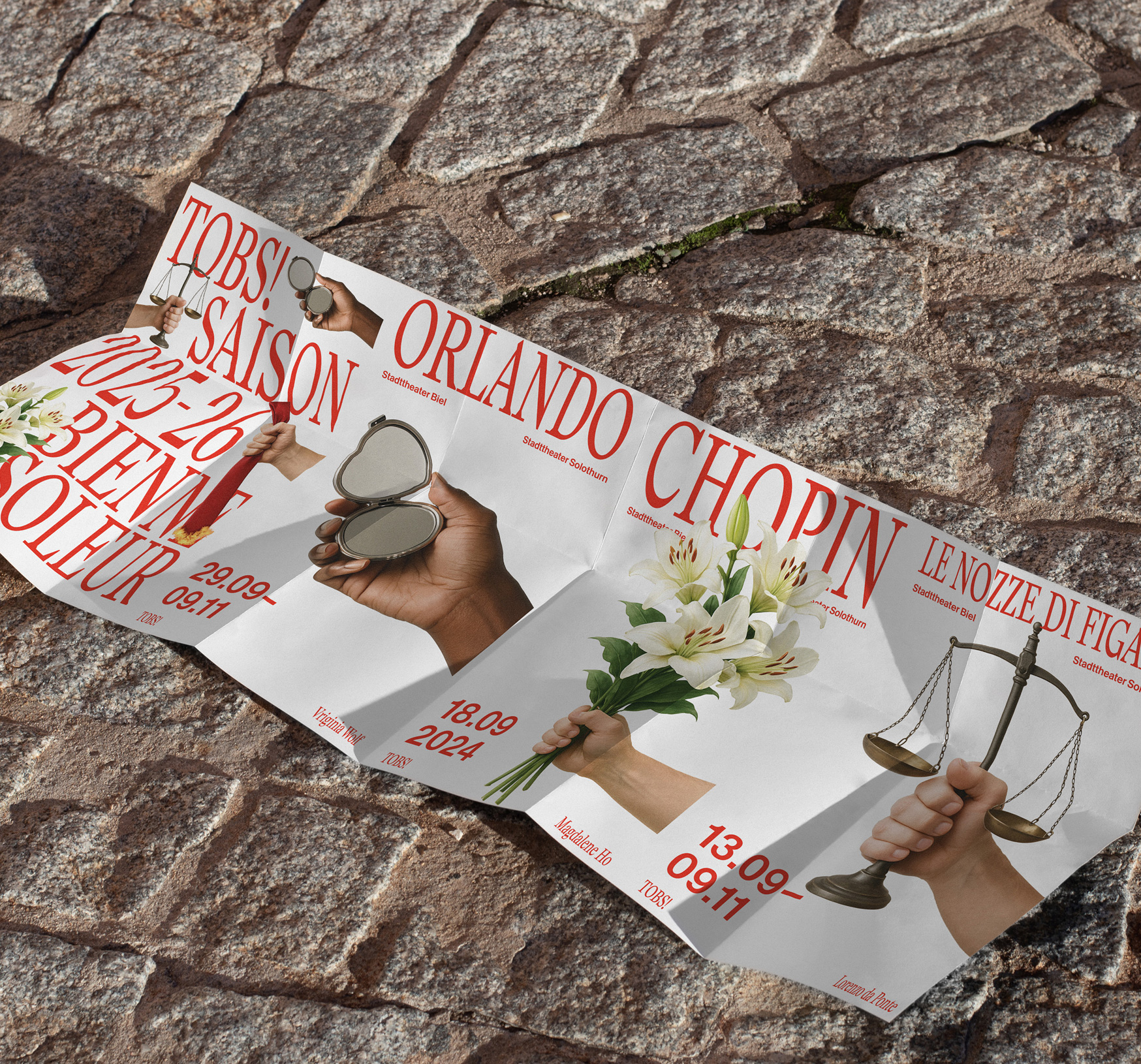
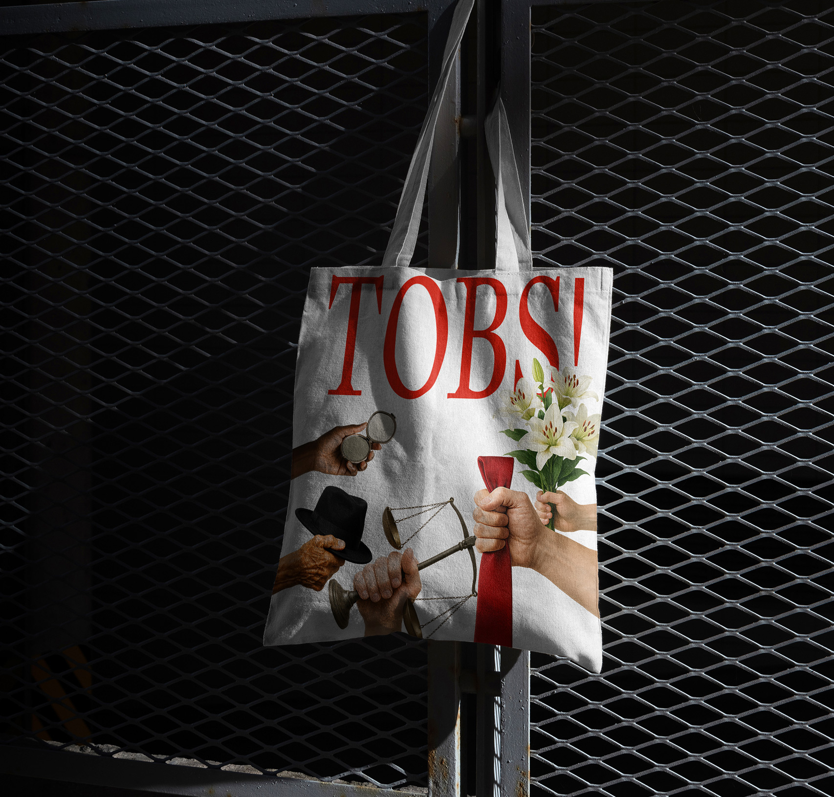
Tobs was the first exam project of my training at the Pôle Arts Appliqués in La Chaux-de-Fonds, supervised by Emanuel Criveli. The brief was to build a visual identity from scratch and roll it out across different formats: poster, animation, website and tote bag.

Concept
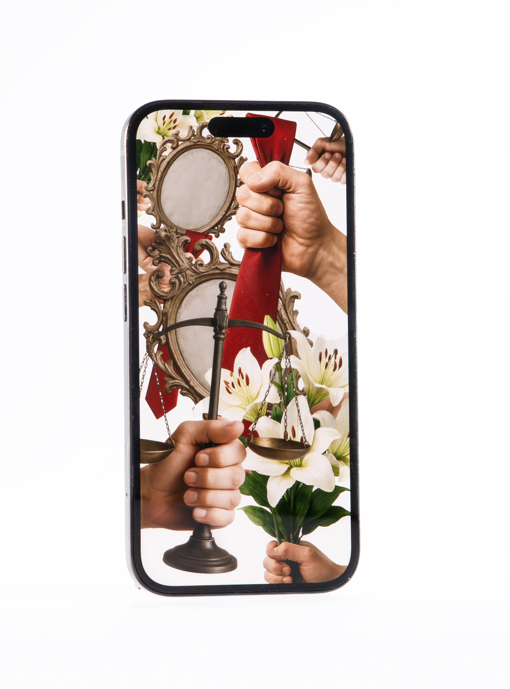
The photographic identity is built around the body, the primary tool of the performing arts and a symbol of the human bridge between audience and artist. The hand always holds an object that refers to the piece.
Typography
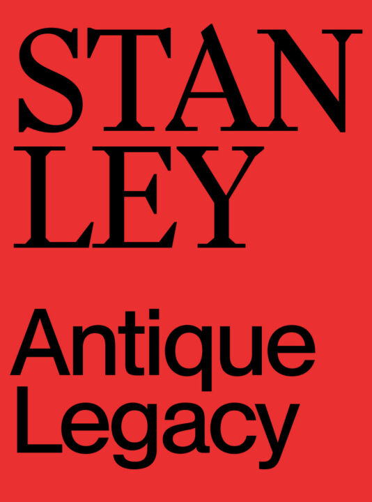
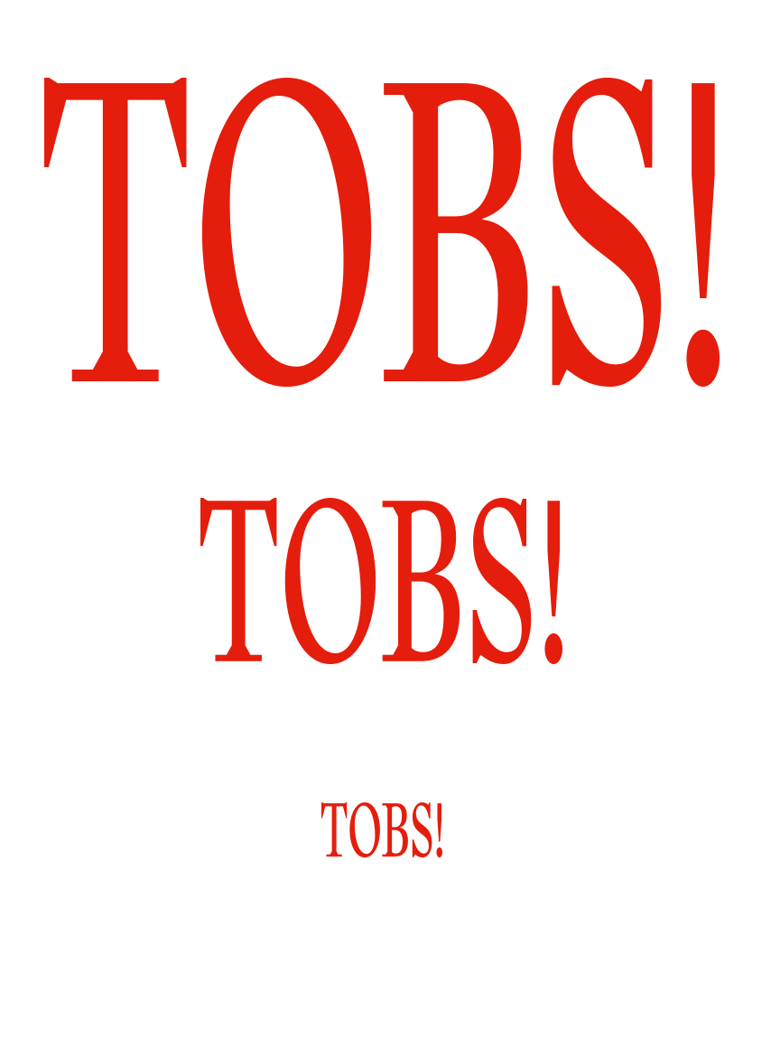
For the typography, I chose Stanley and distorted it to make it feel like a shout, a nod to the performing arts, where the voice plays a central role. Everything is red, referencing the flags of the two cities where Tobs is based. I then paired it with Antique Legacy for more universal readability.